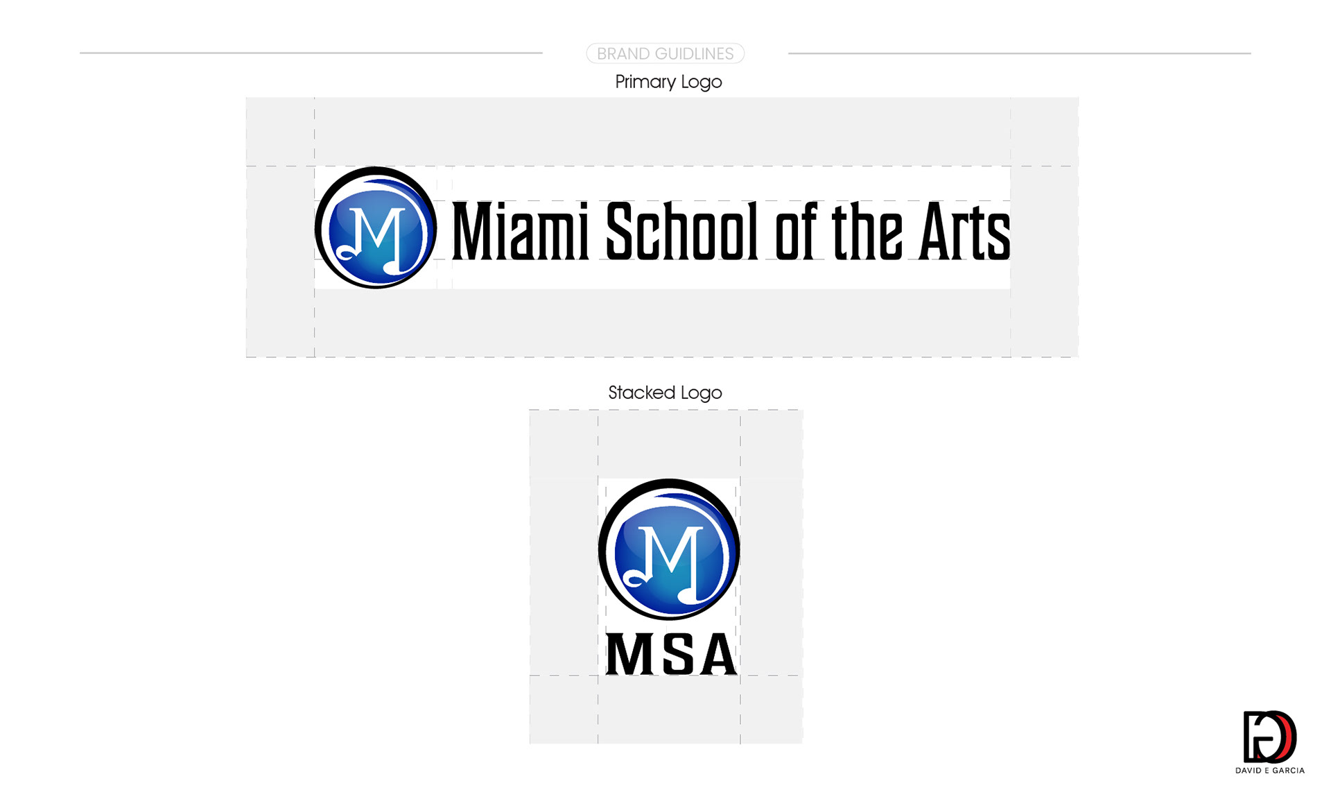
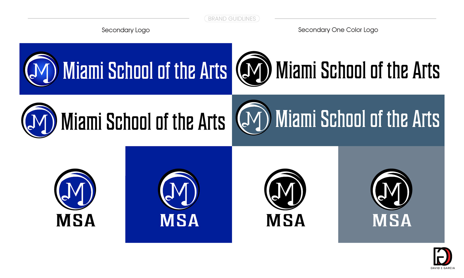
Logo Refresh & Brand Refinement
The MSA logo was strategically refreshed to bolster visibility, strengthen brand recognition, and ensure consistency across all brand touchpoints. By refining the brand’s suffixation and standardizing logo applications, the updated design ensures clear, memorable identification and a cohesive visual presence across digital and print collateral.
Challenge & Purpose
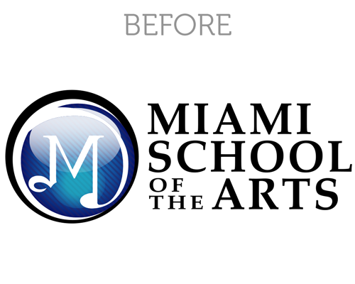
The original logo lacked consistency and impact across different applications, limiting brand recognition in a multichannel marketing environment. The goal was to modernize the brand identity while standardizing usage for a cohesive visual presence
The original logo lacked consistency and impact across different applications, limiting brand recognition in a multichannel marketing environment. The goal was to modernize the brand identity while standardizing usage for a cohesive visual presence
Solution: Logo Refresh
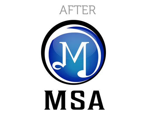
The refreshed MSA logo introduces bolder typography and a modern aesthetic, improving legibility and visibility across all platforms. The updated design ensures the brand stands out, is easily identifiable, and performs consistently across print, digital, and social media channels.
The refreshed MSA logo introduces bolder typography and a modern aesthetic, improving legibility and visibility across all platforms. The updated design ensures the brand stands out, is easily identifiable, and performs consistently across print, digital, and social media channels.
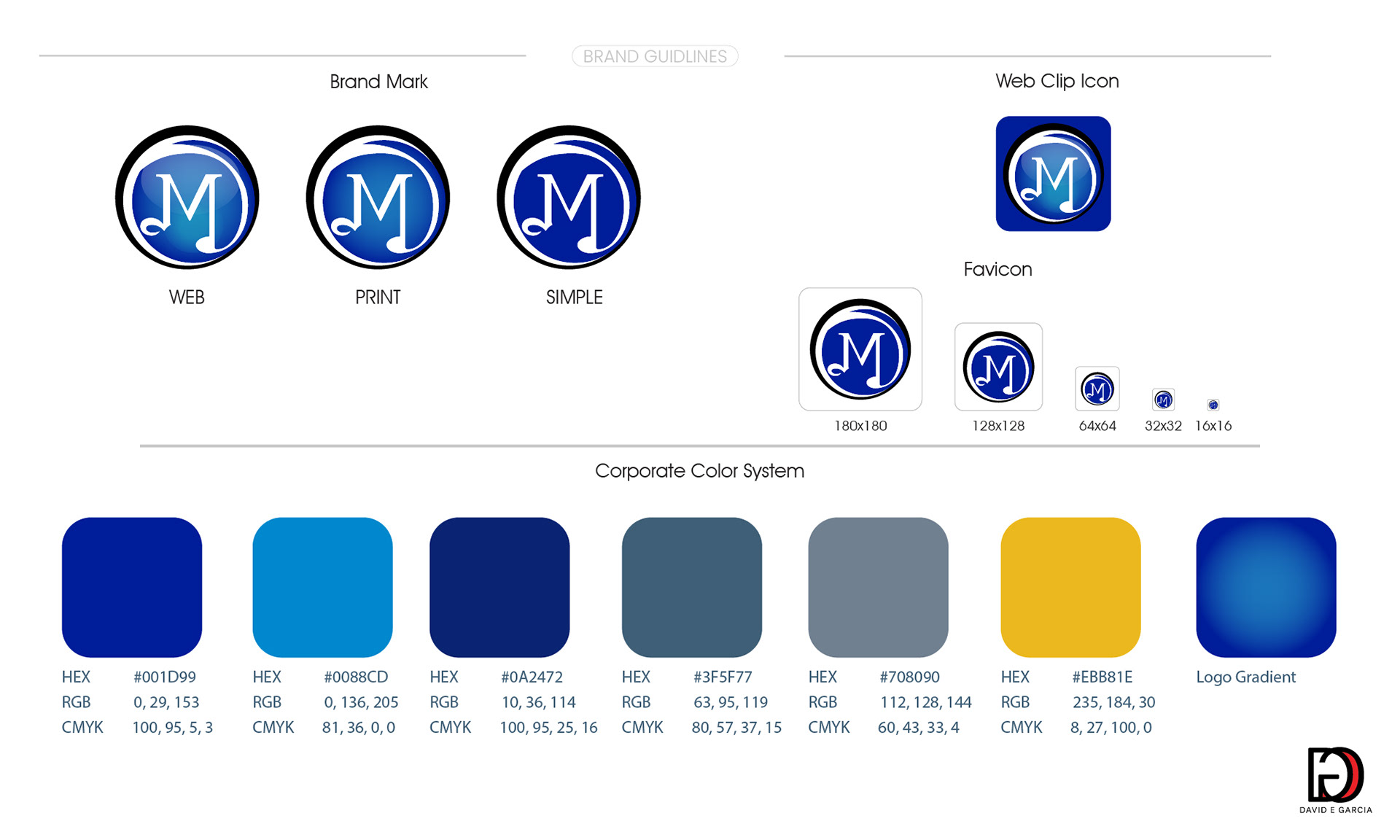
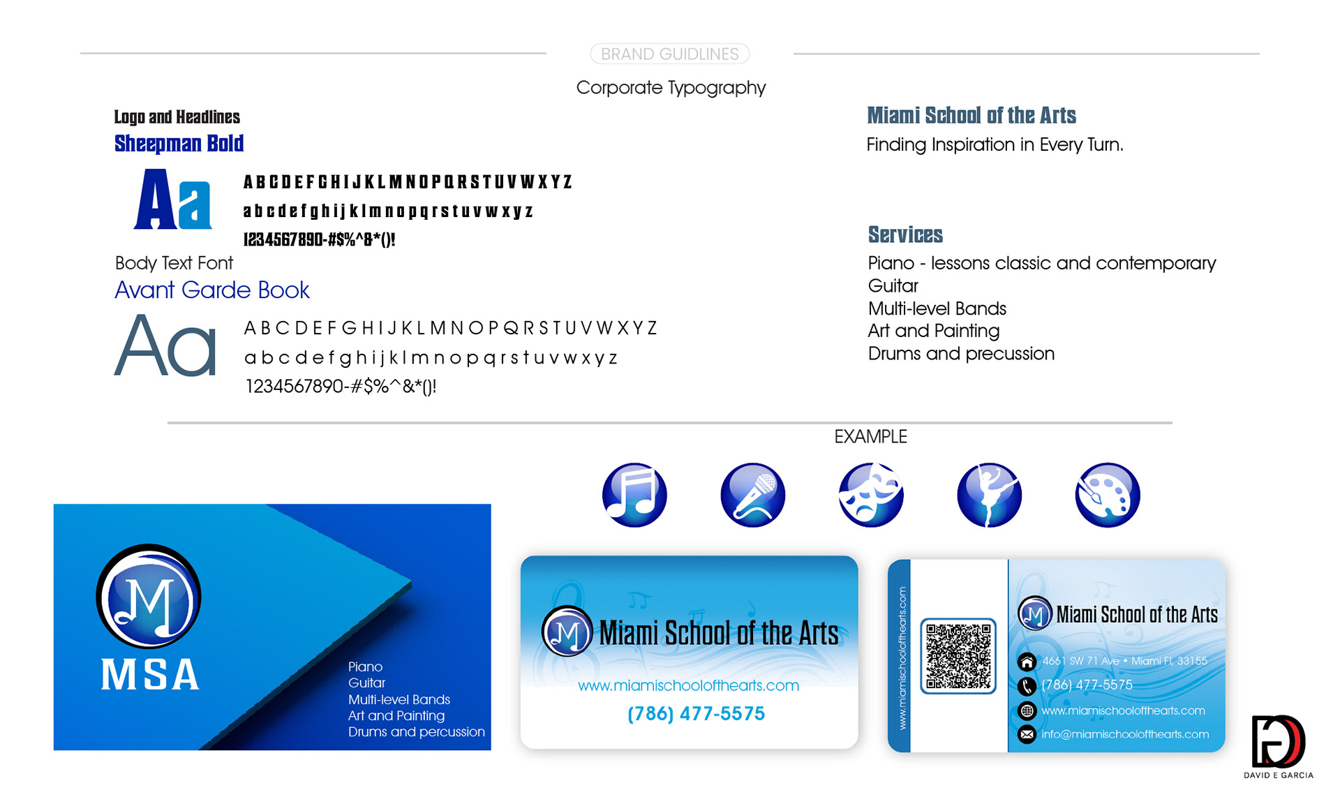
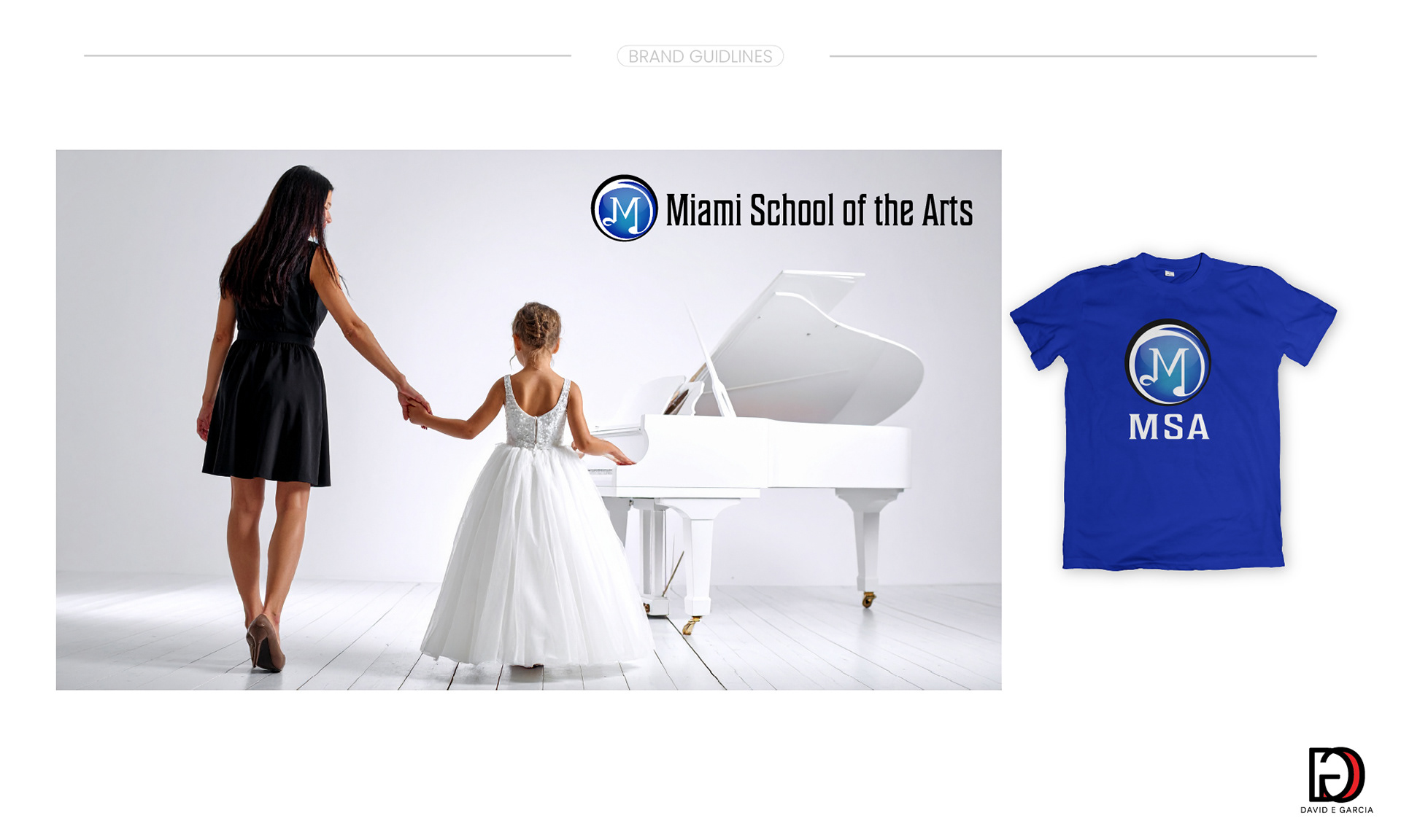
Refreshed Identity Overview
A snapshot of the refreshed MSA branding guidelines, showcasing key elements of the updated identity. The full system ensures consistent application across all touchpoints.