Client: Julian Alexander & Associates - T20 Yorker Energy — Concept Brand Refresh
Project Type: Concept Proposal / Visuals for Investor Pitch
Role: Art Direction, Brand Strategy, Visual Design
Project Type: Concept Proposal / Visuals for Investor Pitch
Role: Art Direction, Brand Strategy, Visual Design
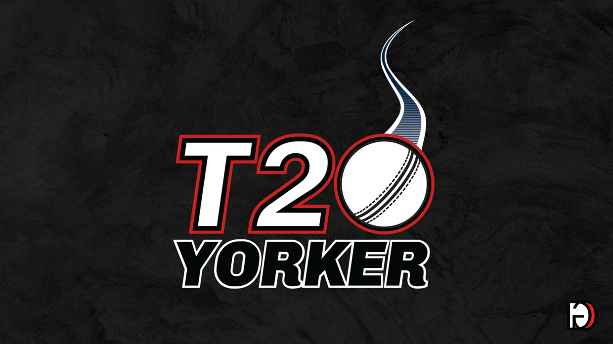
The Project
As part of T20 Energy’s international relaunch, I was approached to explore a potential brand refresh ahead of their investor presentations. Although the project was never fully produced, I developed a conceptual direction and visual identity system aimed at modernizing the brand and positioning it within the global cricket and youth lifestyle market.
The Challenge
The original branding leaned heavily on classic sports motifs, limiting its appeal to an older and more regional fan base. With cricket’s rapid rise on the global stage and growing influence in youth culture, T20 Energy needed to redefine its visual identity — to stand out not just on the field, but in lifestyle spaces where passion and individuality me
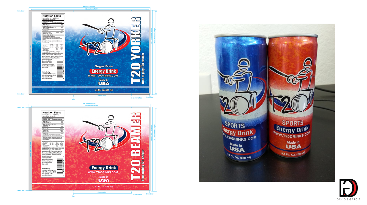
Original Product Offering
The Approach
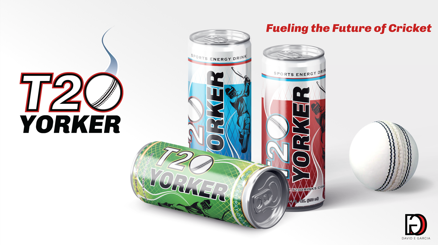
The rebrand focused on creating a more expressive, rebellious, and contemporary tone.
The visual language draws from the fast-paced energy of T20 cricket — dynamic lines, bold color contrasts, and an elevated, lifestyle-driven aesthetic. The new packaging, wordmark, and digital identity channel both the sport’s momentum and the brand’s fearless spirit.
The visual language draws from the fast-paced energy of T20 cricket — dynamic lines, bold color contrasts, and an elevated, lifestyle-driven aesthetic. The new packaging, wordmark, and digital identity channel both the sport’s momentum and the brand’s fearless spirit.
The Transformation
Old Identity: Functional, rigid, and performance-focused — limited emotional resonance. New Identity: Vibrant, confident, and lifestyle-oriented — designed to connect with a generation that views cricket as both sport and culture. This shift positions T20 Energy as more than a drink — it’s a badge of attitude and belonging for the global cricket community.
The Result
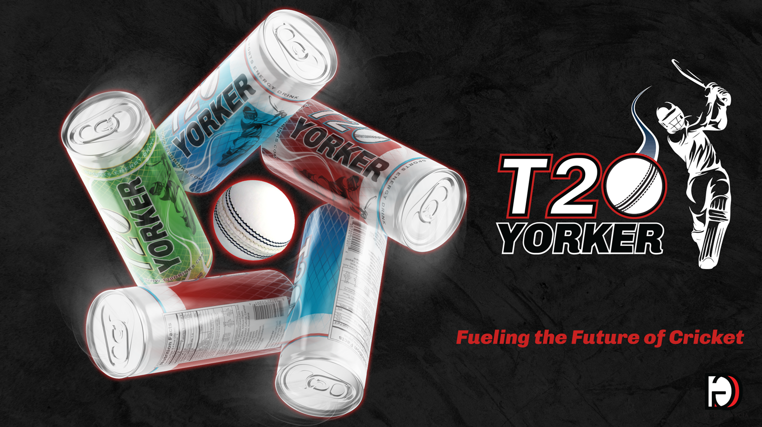
A complete evolution from sporty to lifestyle.
With a refreshed tone of voice and visual system, T20 Energy is now primed to expand its reach into international markets and capture the loyalty of a new generation of fans and players — fueling the game on and off the pitch
With a refreshed tone of voice and visual system, T20 Energy is now primed to expand its reach into international markets and capture the loyalty of a new generation of fans and players — fueling the game on and off the pitch
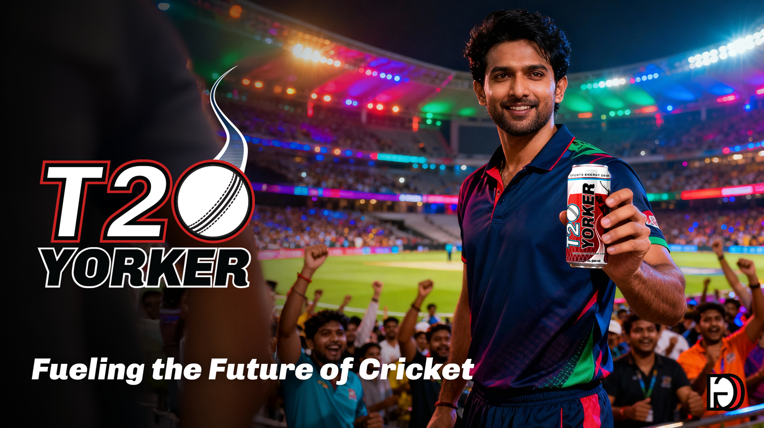
Concept Summary
This proposed rebrand emphasized bold contrast, dynamic movement, and lifestyle-driven imagery—shifting T20 from a purely performance-oriented energy drink to a cultural badge for modern cricket fans and players. The visuals were used internally to communicate brand potential to investors.